
Wednesday, 28 September 2011
Tuesday, 27 September 2011

Monday, 26 September 2011
Hierarchy Exercise
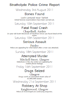
My three page layouts based on the information from the Strathclyde Police website:


Inappropriate Font Useage
After recieving this menu through my front door last night, I took one look at it and nearly threw it in the bin. I'm not quite sure what style whoever designed this menu was going for, however I find it hard to read and not very attractive to look at. I find the header font inappropriate for use in a menu as it looks messy & informal and the colour scheme isn't very appealing either.
I think the restaurant chose this font as it appears quite casual- perhaps to fit in with the idea of a take away being effortless for the customer ?
The font gives me the impression that quality is not a main priority in this menu and this approach could be reflected in the food that is served.
However it does not communicate as effectively as perhaps a more simple font would.

A more appropriate header font for use in a menu could be any of these examples:
They are more simplified and do not have as much character as the previous font.
I think the restaurant chose this font as it appears quite casual- perhaps to fit in with the idea of a take away being effortless for the customer ?
The font gives me the impression that quality is not a main priority in this menu and this approach could be reflected in the food that is served.
However it does not communicate as effectively as perhaps a more simple font would.

Special Offers
Special Offers
Special Offers
- these examples appear more formal and legiable for use on a menu.They are more simplified and do not have as much character as the previous font.
Subscribe to:
Comments (Atom)